
Rich textures create a visually stunning home transformation
Time for a Refresh
Nooks that were great for creating clutter. Finishes and flooring that looked tired and outdated. An overall style and function that wasn’t working any more.
This and more got our client thinking it was time for a home makeover starting with the kitchen. And then along came news of a baby on the way.
Suddenly a bigger home transformation, including an update for the living room and powder room, with a dependable completion date became a top priority.
Our client wanted a sparkling, modern home to raise their new family – with a kitchen, dining room, and powder room that “popped”.
Retain the existing layout
The home started with good bones and there were many features our client loved and wanted to retain. For example, a beautiful arched living room window and cathedral ceiling, gas fireplace, interesting angled walls and posts and the overall home layout worked well.
The challenge was to work with the home’s existing footprint and incorporate key features into a new design that provided a cleaner, brighter look while improving functionality, particularly in the kitchen.
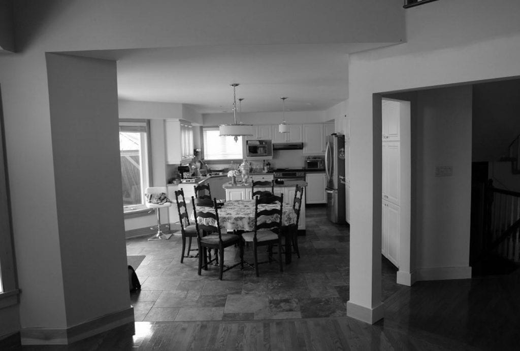
BEFORE: A bit dated and dreary
Visual texture
To give the illusion of a larger space, lighting, colour choices and textures were important design considerations. Although texture often refers to the physical feel of something, it also refers to the visual look.
Texture can be created with smooth surfaces by using contrasting materials, shading, colours and other visual elements. In so doing, a designer can create the perception of texture. This was the strategy used by the OakWood Design Team, working closely with our client, who had a real design eye and ability to visualize.
Here’s a quick room-by-room synopsis with before and after photos starting with the kitchen.
Walnut for warmth
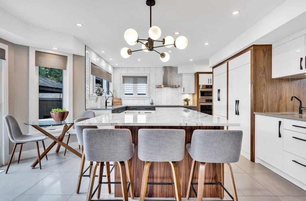
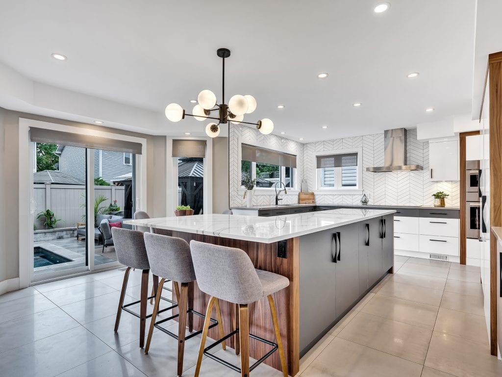
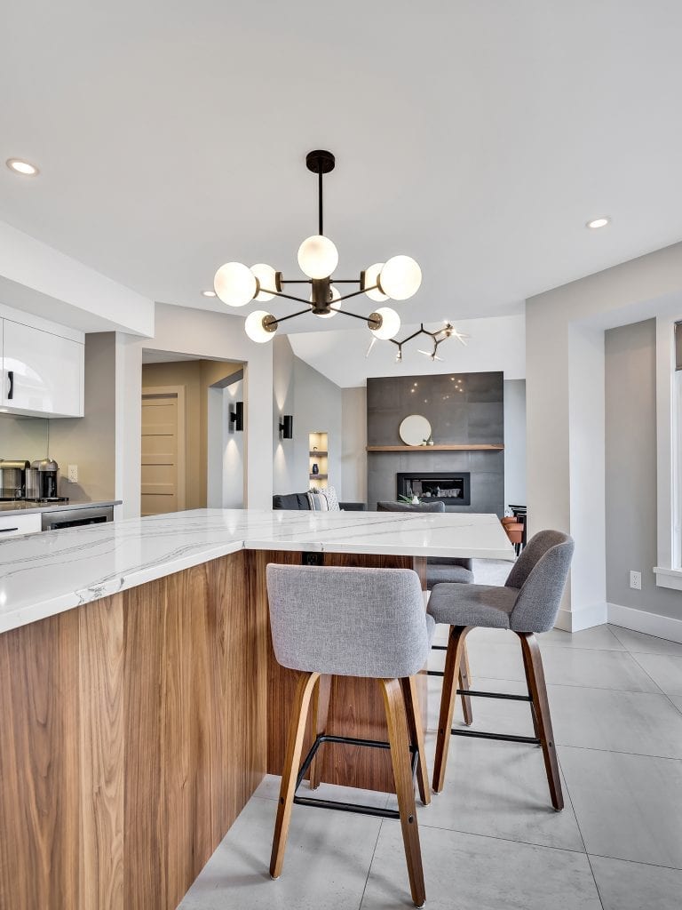
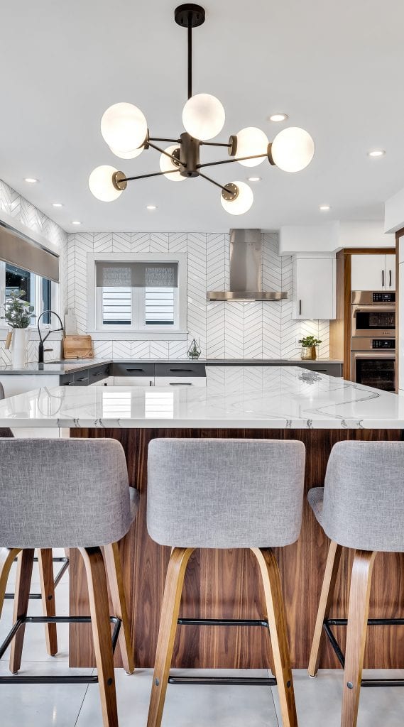
The centerpiece for the kitchen was an L-shaped island with two runs of cabinetry.
A generous counter overhang created space for three bar stools that tucked neatly out of the way at one end. Our client fell in love with walnut as the wood of choice because of its warmth and texture.
The beautiful grain of walnut adds visual texture
Walnut is a tight grained wood that is prized by cabinetmakers for its beautiful grain, strength and rich colour. It’s also a less common species and this limitation makes it more expensive. The tradeoff is that in addition to having unique aesthetic appeal, it’s a high quality, durable wood that’s going to last.
In this project, walnut was used extensively as both a major feature and accent.
For example, on the L-shaped island, chocolate brown walnut was used to finish the end and outside panel, while the inside was finished in lite grey cabinets.
Walnut was also used for accent trim to frame white cabinets in the kitchen and in the living room for the mantel.
Cabinetry details
Walnut cabinetry is only available in the Unique Series from OakWood’s exclusive cabinetry partner, Cabico. In addition to providing more choices of wood species, including walnut, Unique offers virtually unlimited stain options, finishes, and door styles for the ultimate in customization. It is a truly upgraded series for a discerning homeowner with a precise vision.
Another advantage of the Unique Series is that everything’s made to measure. In contrast, most mass produced cabinetry has limited options for customization, typically only available in one inch increments with limited door sizes, styles, colours and finishes.
An exact fit with no gaps
Customization is a particularly important consideration when working within the existing room layout – in this case the kitchen. The OakWood Team was able to design into that existing kitchen footprint exactly and avoid unsightly gaps or spaces that require fillers.
Upper and lower perimeter cabinets were MDF with a gloss finish to give the kitchen a brilliant sheen. To add a blush of colour and warmth, the first row of drawers was finished in lite grey with the remaining lowers and all uppers finished in MDF white.
Panelled appliances reduce visual clutter
The dishwasher and fridge were also panelled so that they blended seamlessly into the cabinetry. Panelled appliances also have the advantage of simplifying the number of finishes and “quietening” the kitchen. In a smallish space with a lot going on, paneling can be a useful design technique.
Stunning quartz countertops
The perimeter countertop and island countertop were both installed in Cambria quartz, one of the hardest surfaces available with natural looking stone patterns that imitate marble.
The perimeter counter is Queen Anne from the Marble Collection™. This features a velvety grey marbled background with billowing white streams that look like the rippling movement of water. In contrast, the island countertop was white Cambria Britanica™ quartz with grey veining. Together, these countertops have a beautiful calming effect.
Also of note is how the dramatic veining on the island travels with the shape of the island and down the longest length towards the cooktop. This helps draw the eye to the back of the kitchen helping make the room look larger.
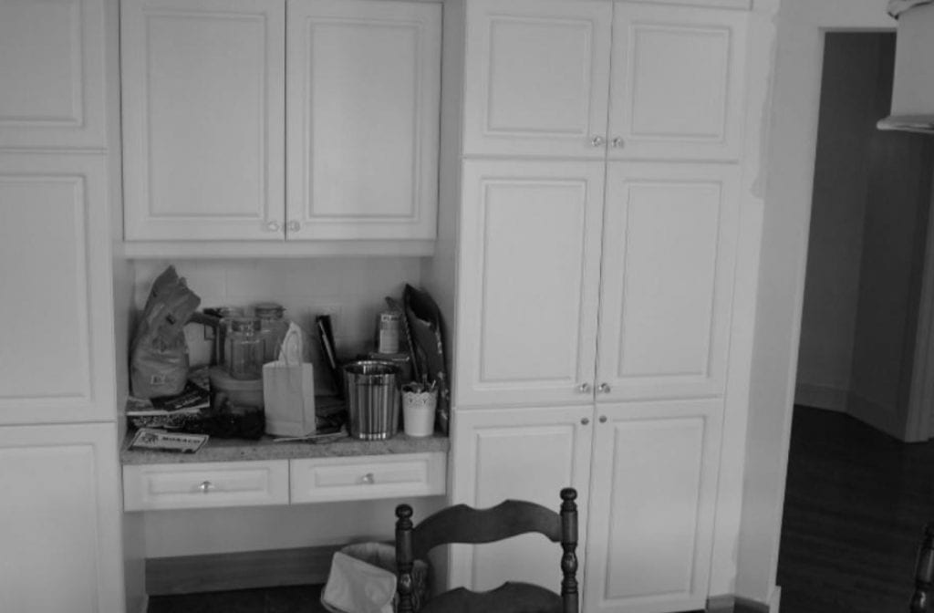
A nook that attracts clutter
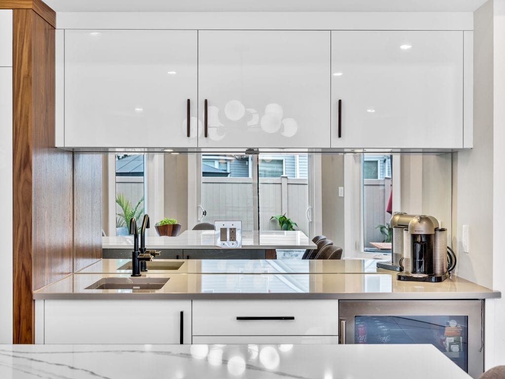
A mirrored backsplash framed with walnut creates a “wow” accent that adds reflective light
Mirrored backsplash looks like a window
Another design technique that was used to create the illusion of a larger kitchen was the use of a mirrored backsplash for a small breakfast bar and work area (see above). Framed in beautiful walnut on one end, this reflects the view of the outdoor patio. Visually this looks like a small window and opens the room nicely.
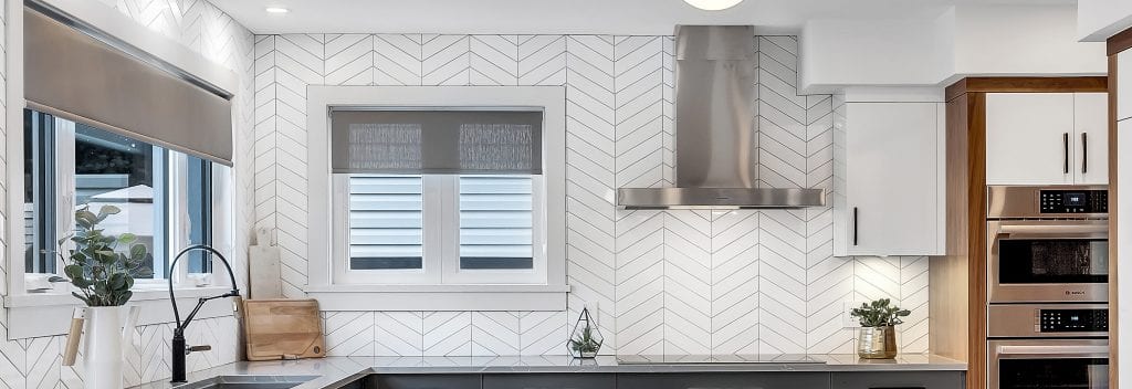
Chevron tiles for more texture
The main countertop and work area featured chevron tiles on two walls. Again, to create visual texture and add dimension to the wall, some tiles used a gloss finish and others were finished in matte.
The window above the sink in the main work area was enlarged to provide more natural light and a view of the amazing backyard that features a pool and patio.
Porcelain for durability
24 x 24” porcelain tiles were used for the floor. Interesting factoid: porcelain clay is denser than the clay used in ceramic tiles.
So porcelain is more durable, abrasive resistant – and better suited for heavy usage, like walking. That’s why porcelain is a favourite flooring solution. It can also be used handily for wall tile. However, the opposite is not true: wall tile is not designed to withstand the weight and heavy use of a floor.
Breakfast or dinner in bistro style
Bistro inspired lighting
Rounding out the kitchen was an ultra-modern pendant light from Nuevo’s Dylan Collection. This featured 8 round white glass shades radiating outward from a simple, cylindrical stem to present an elegant, European bistro inspired aesthetic.
Living room details
The existing living room was graced with a beautiful vaulted ceiling and arched window. However, the room inherited an odd layout that resulted in the gas fireplace being located off-centre on the main wall.
To correct the visual imbalance, the OakWood Team recommend angled cubbies and a stunning floor-to-ceiling fireplace feature-wall. This also used 24 x 24” porcelain tile accented with a natural wood mantle using – you guessed it – walnut.
The combination of framed wall and cubbies created the compelling illusion that the fireplace was centred on the wall, giving the room a more balanced and coordinated look. A new direct vent, zero-clearance gas fireplace was purchased by the client, and professionally installed by OakWood.
You can see many of these details in the before and after photos below.
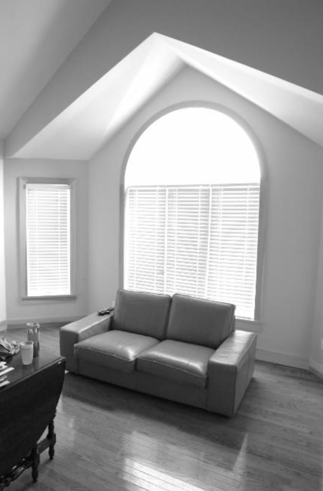
Before
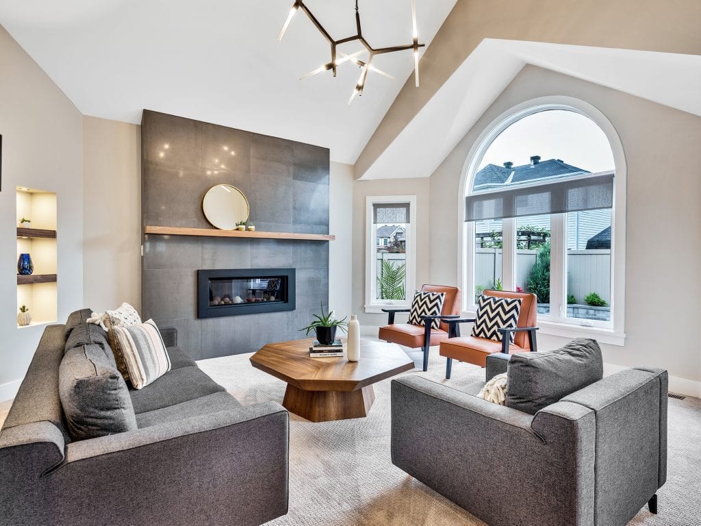
After
Durable Mohawk, SmartStrand carpet was recommended by OakWood. In addition to being plush, soft and durable, this “forever clean” carpet is completely stain-resistant. A perfect, worry-free flooring solution for a young family and inevitable “oops” spills.
An elegant LED overhead light pendant, aptly named “Light Saber”, reinforces a sleek modern look and commands attention.
Superb interior furnishing by our client pulled all elements together to create a sophisticated yet functional living room ready for endless hours of family enjoyment.
Luxurious powder room
Finally, a small nondescript powder room on the main level enjoyed a remarkable transformation.
Key elements included a floating walnut cabinet with a Mersey Cambria quartz top. Mersey is a deep, glassy black stone with streaks of white that resemble “lighting across a night sky.”
The floating wall cabinet is framed by small dark grey mosaic tiles with a chevron pattern to once again, create visual texture.
Gold sconce accent lighting provided the right touch of elegance and soft lighting to finish the look.
The overall effect is bold and chic: a small room that makes a big statement.
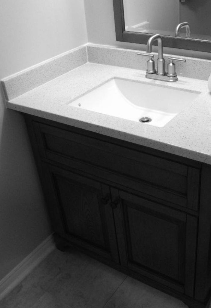
Before
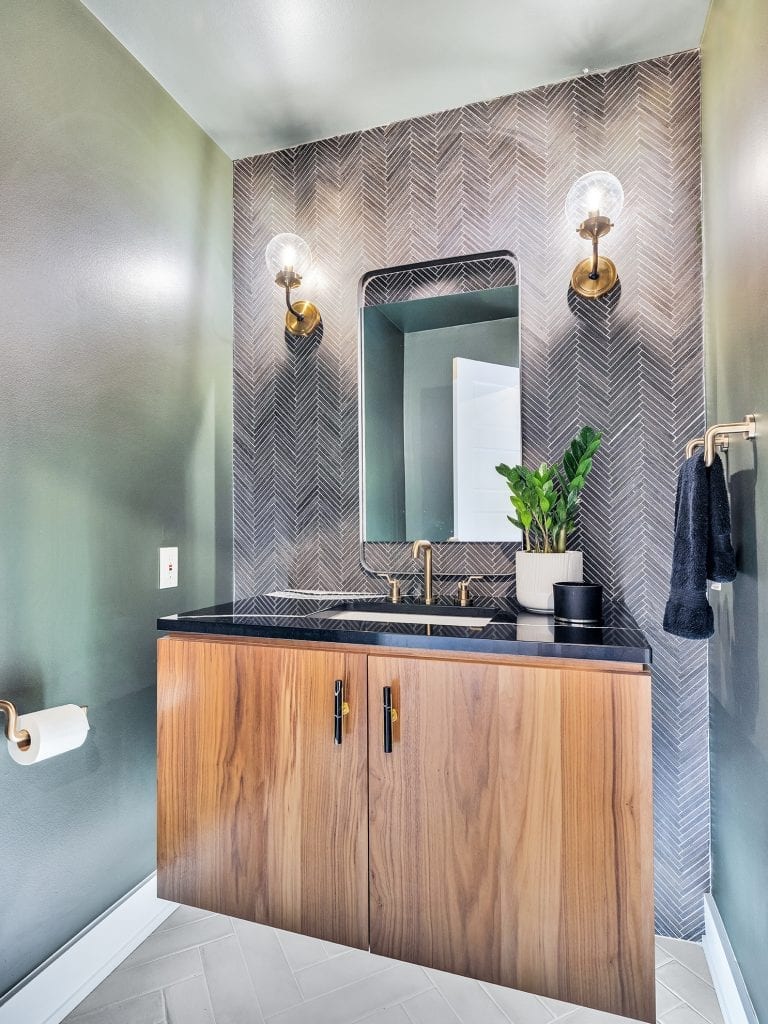
After
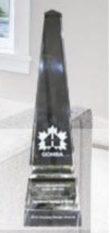
2019 GOHBA Design Award Winner
Housing Design Award Winner!
Our client was thrilled with the final transformation. This is always the ultimate reward for the OakWood Team. However, in this case there was a special bonus: the project also won a best renovation award at the Greater Ottawa Home Builders’ Association 36th Annual Design Awards in October.
The OakWood Team was honoured to win this prestigious award – and even happier for our client who now has a beautiful home to enjoy for years to come.

Patricia Liptak-Satov, OakWood, Vice President Operations. Patricia is dedicated to improving OakWood’s approach and introducing new methods to ensure a responsive, customer centric company that exceeds client expectations.